Case Study: UX Research & Product Strategy
Rec the Experience
Reimagining UofM Recreation’s digital presence: student research, comparative and heuristic evaluation, and a set of actionable UX recommendations.
Operations & Strategy
UX Research
Client
UofM Recreation
Timeframe
Jan 2025 – Apr 2025
Role
UX Research & Design (team of 5)
Team
UofM Rec Director, Staff, and 5 UXRD
Tools


Recommendations From the Project

Improve the visibility of the search button by integrating a search bar directly into the main navigation tabs.

Fix the content layout of the page, including the Fitness classes schedule.

Fix contrast errors to meet WCAG requirements.
Problem
How might we increase student usage and support a rebrand?
How might we improve the UofM Recreation website to increase student usage of campus facilities and support the organization’s rebranding efforts?
Increase Usage
Only 70% of students use the facilities.
Rebranding
UofM Recreational Sports to UofM Recreation.
Identify Website Errors
Review the website to identify issues for users.
Understand Students
Interact with students to understand their needs and wants.
Research & Analysis
Interview Profiles
6 Students
Frequent and infrequent student users of the facilities.
1 Marketing
Social media and marketing lead for the department.
2 Instructors
Instructors and leader coordinators running classes.
The Web Architect
Web architect responsible for the department’s website.
Comparative Evaluation
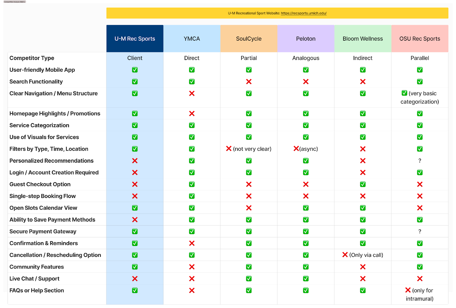
Benchmarking 5 fitness and rec platforms
Analyzed 5 fitness websites (YMCA, SoulCycle, Peloton, Bloom Wellness, and OSU Rec Sports) against U-M Rec Sports across search, navigation, booking flow, payment, and community features.
Heuristic Evaluation
Applied Jakob Nielsen’s usability heuristics to five subpages (GroupX, Club Sports, Group Train, and Reserve Equipment) to surface concrete, severity-rated findings.

Jakob Nielsen

Heuristic evaluation findings log, severity-rated
Key Findings
Navigation is unintuitive
Users struggle to find schedules and book classes.
Booking flow lacks filtering
No filtering or personalization in the booking flow.
Community features are absent
Limits engagement between members.
Inconsistent labeling
Inconsistent labeling and visual hierarchy across pages.
“Users have to type in and navigate the same info every time they book a class or swimming appointment; it’d be way easier if the site could remember it and save some time.”
From a student usability interview
Recommendation
Turning research into fixable UX wins
Findings pointed to unintuitive navigation, a booking flow with no filtering, missing community features, and inconsistent labeling. Recommendations grouped into Navigation, Accessibility, Icons, and Content Layout.
Before

After

Navigation: Make CTAs More Visually Distinct

Key actions like ‘Apply for a mentoring position’ were plain hyperlink text. Recommendation: use buttons or bold, standalone links for key actions.
Content Layout: Accordion Button Issues

Class Description cards had no arrows or +/- affordance signaling collapsible content. Recommendation: add clear expand/collapse indicators.
Lack of Accessibility: WAVE
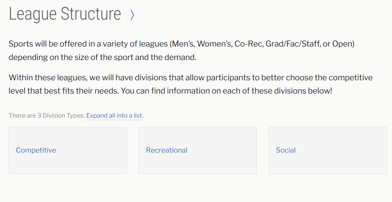
Ran the site through WAVE and found low-contrast text throughout, including on the League Structure page, where headings and body copy fall below WCAG contrast requirements. Recommendation: fix contrast errors flagged by WAVE.
Icons: Equipment Rental
Equipment has icons; renting it doesn’t
Outdoor equipment categories each have a clear icon, but there’s no matching icon or button for the actual rental action; reserving equipment is buried in a plain-text instructional page.

Equipment categories have icons, but no rent action

The actual reservation flow is a plain text-and-form page
Content Layout: Status Visibility & Filtering
Before

After

U-M's Club Sports grid is icons and names only, no schedule, seats, or status. YMCA's class list shows time, instructor, open-seat counts, and a Reserve button right in the list.
Reflection
Impact and reflection
New Facility Launch
The new facility opens an opportunity to test new naming conventions and page layouts from the ground up.
Accessibility and Inclusion
Conducting accessibility audits (keyboard navigation, screen reader compatibility) is the natural next step.
Voice Search Exploration
Adding voice features could appeal to a broader range of users navigating the site.
Watch the Final Presentation Video (07:37)
Full walkthrough of the research, findings, and recommendations. Opens on Google Drive.
Impact
−30%
Booking downtime reduced for Group-X users
15
Actionable UI recommendations delivered in the strategic report
+10%
Student participation increase via data-informed marketing
Isaac Tung was part of a 5-person UXRD team conducting research, comparative and heuristic evaluation, and delivering UX recommendations for UofM Recreation.